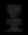
guudpin|質定制作
Branding, Logo, Typeface
guudpin 質定制作
2026
This project reimagines the brand identity of guudpin (質定制作), a spatial design team where logic meets beauty.
Rooted in the ideas of intersection and precision, the new identity reflects guudpin’s modern, logical approach to spatial aesthetics. The word-mark features a bespoke sans-serif typeface that balances vertical and horizontal contrast. The symbol-mark, built from intersecting lines, follows a 63:37 left-to-right ratio—mirroring the width of “guud” and “pin”—to create a contemporary, orderly, and rational brand expression.
To ensure consistency across the system, the logotype was expanded into a full set of custom letterforms, applied across print and collateral. This transforms the identity from a static mark into a flexible, cohesive visual system—designed for clarity, continuity, and communication at every touchpoint.
此案為空間設計團隊 guudpin(質定制作)之品牌識別重塑設計。
以「交集」與「精準」為核心概念,同時回應 guudpin 於空間設計中所展現的現代性與邏輯美學,標準字為平衡直橫筆劃對比的無襯線客訂字體;圖形標誌則依「guud」與「pin」的字組寬度(63:37)切分左右比例,以簡明的線條共構與交會。塑造當代、有序且理性的品牌意象。
為強化整體識別系統的一致性,我們更進一步將標準字字體延伸發展為完整字型,應用於官方印刷品及各式延伸製作物,讓品牌識別不只回應形式,更成為能持續應用、傳播與完整支撐的視覺系統。
Art Director ── 聶永真 Aaron Nieh、陳聖智 Even Chen
Designer ── 林智凱 Chihkai Lin
Motion & Mockup ── 林智凱 Chihkai Lin
Project Manager ── 林彥君 Janice Lin